ART DIRECTION
〰️
ART DIRECTION 〰️
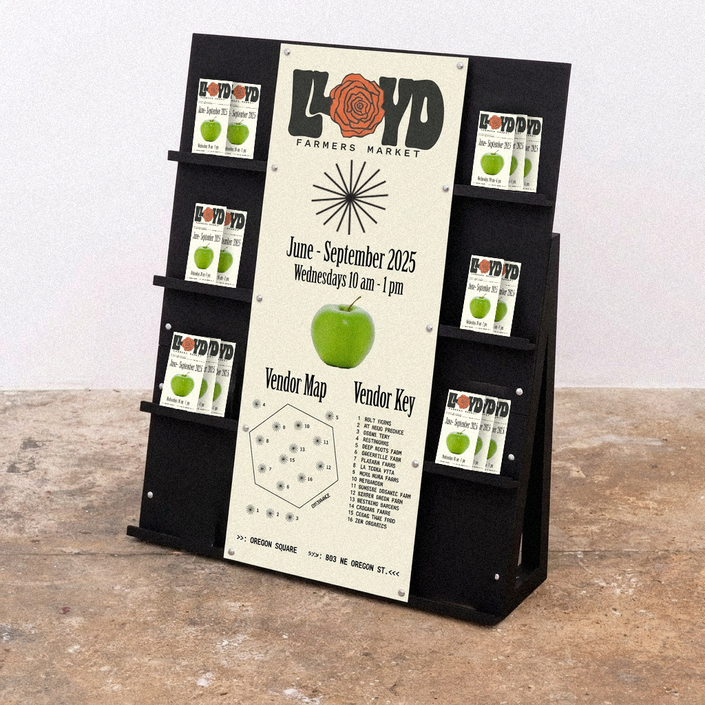
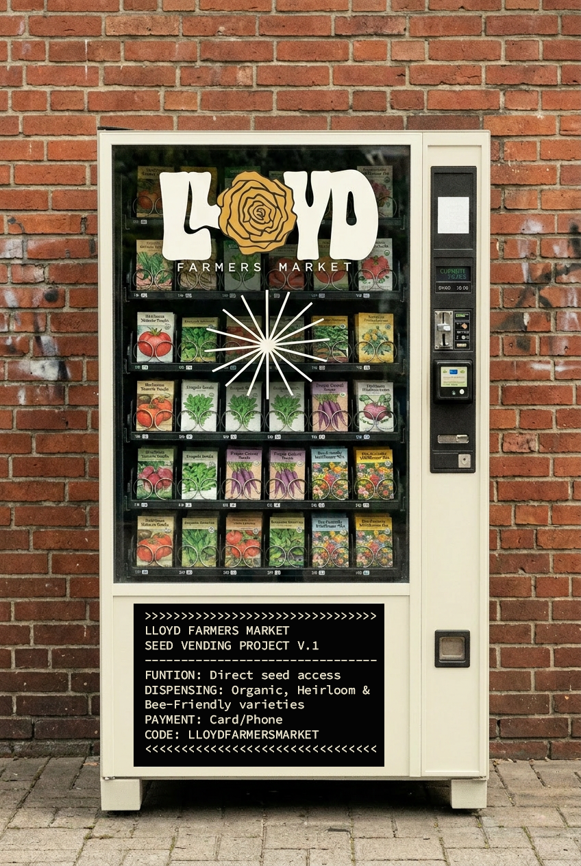
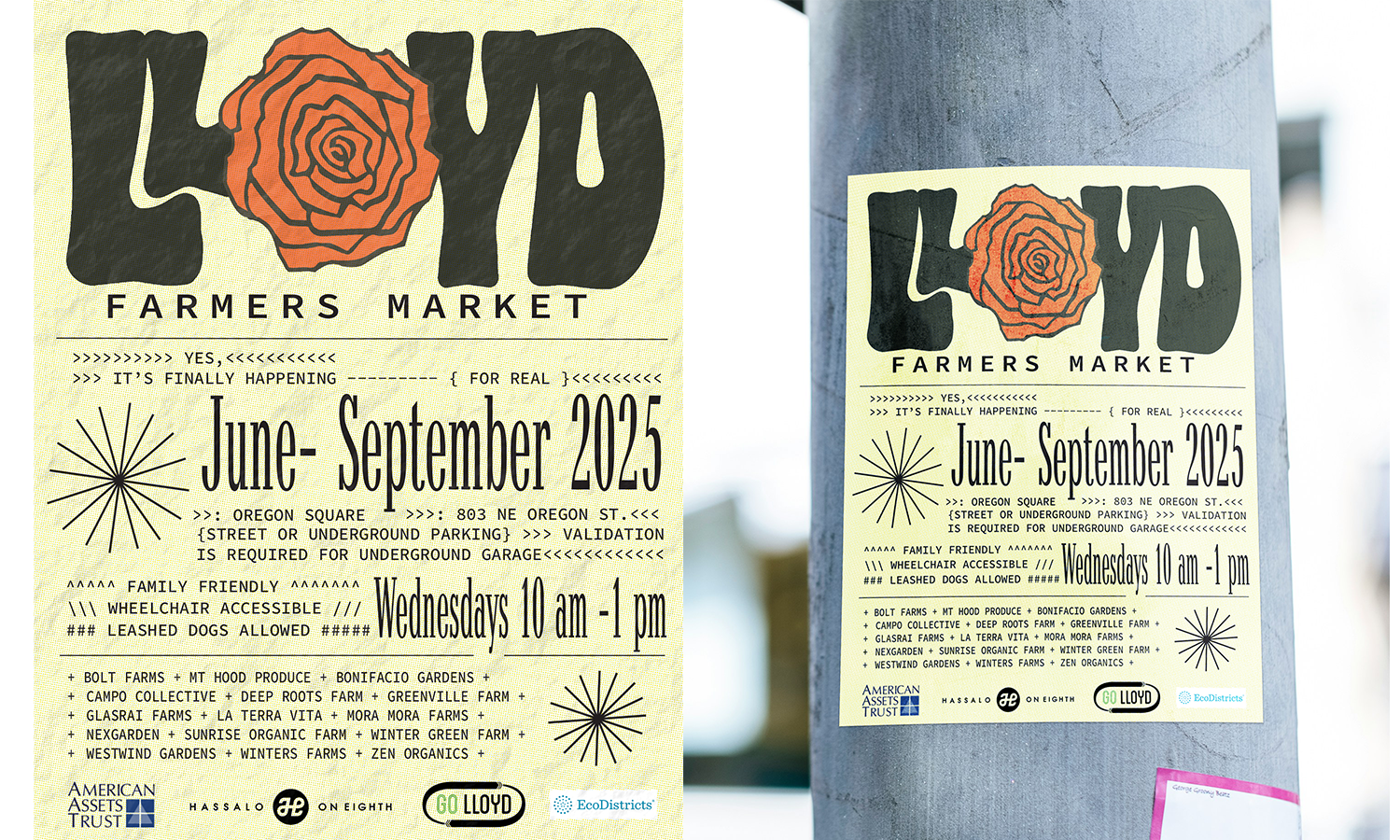
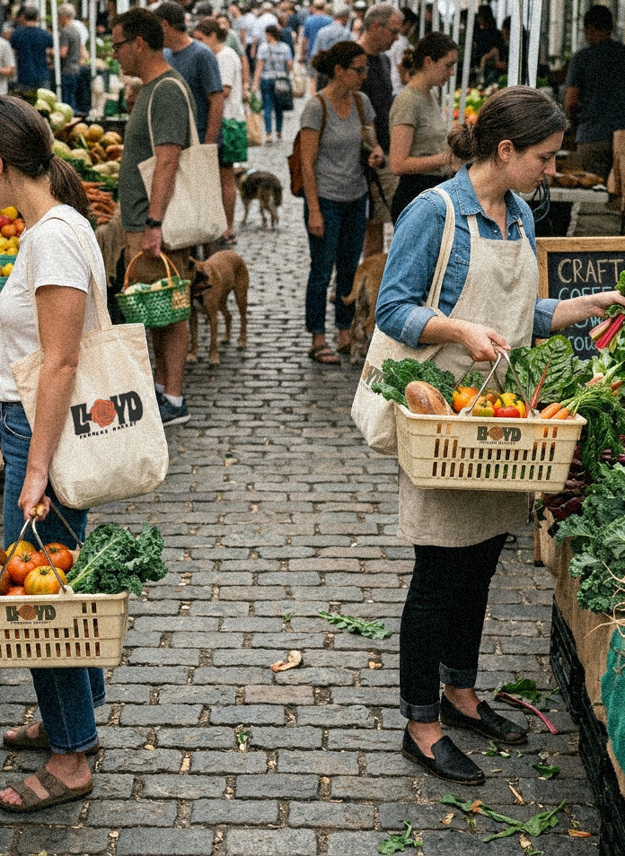
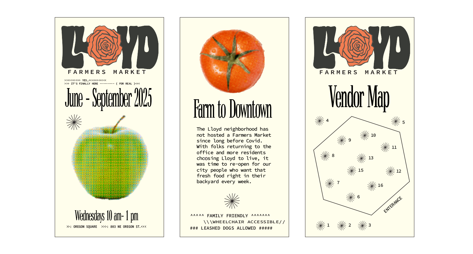
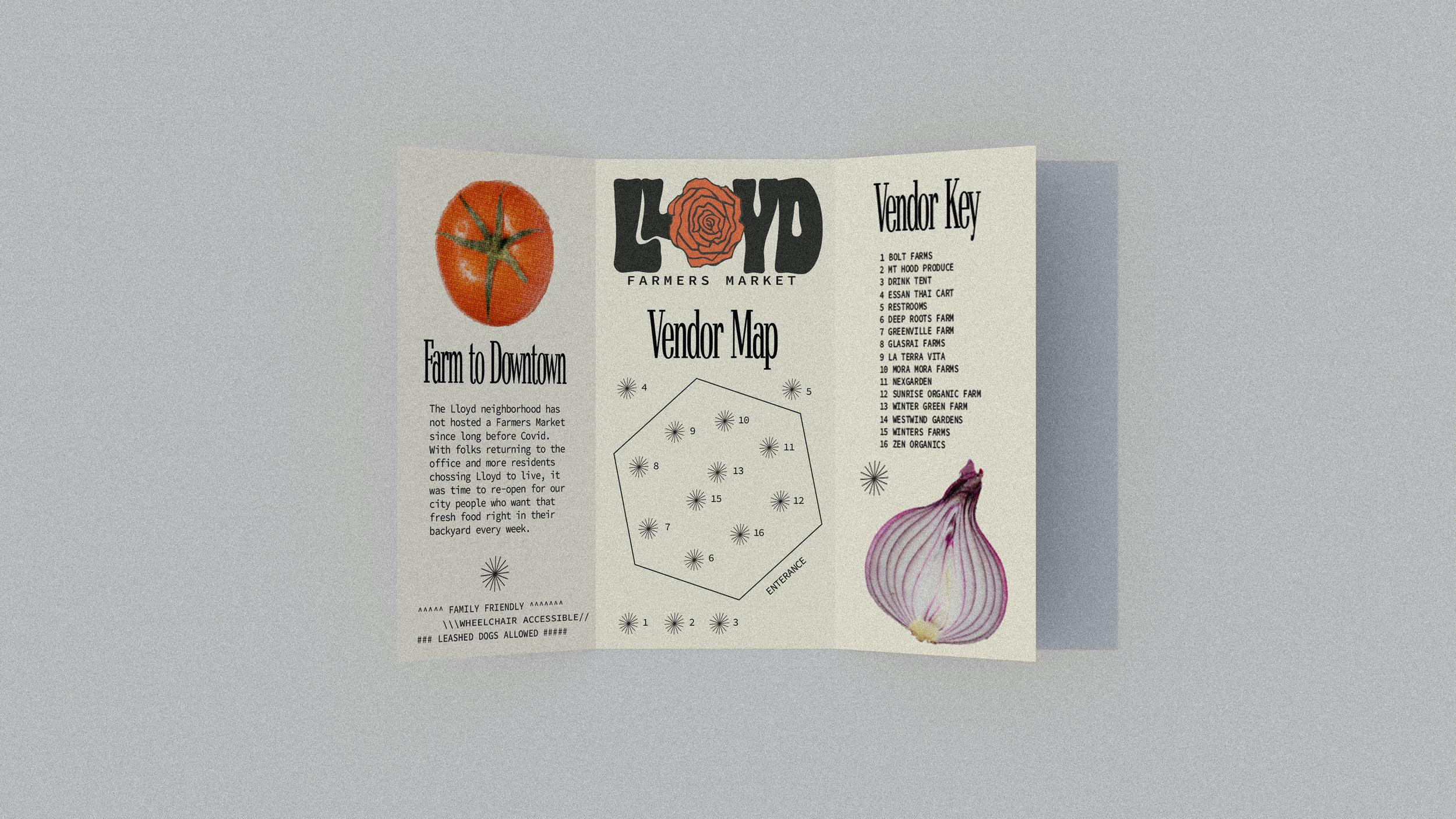
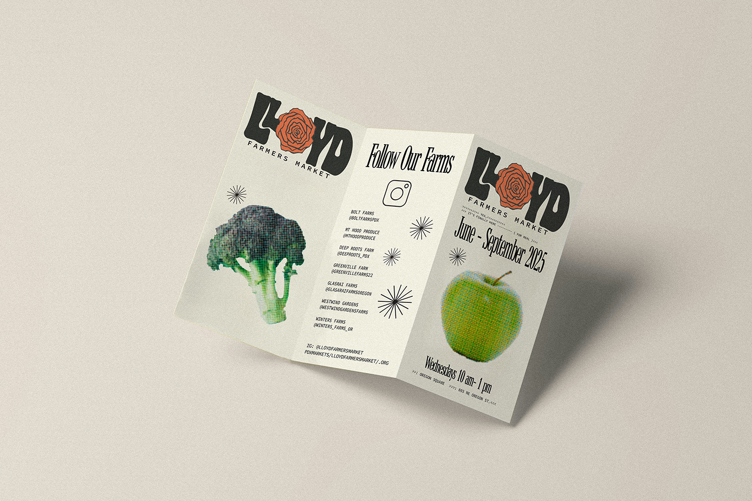
LLOYD FARMERS MARKET- PORTLAND, OR
Art Direction, Campaign Direction, Visual Design, Wayfaring Design, Social Media, Brand Design
Portland is the City of Roses, and the Rose Festival Parade route runs through the neighborhood, making a rose icon appropriate in the type logo
Printed brochure with Market Map, The trifold is given at the market entrance and dispersed through the neighborhood.
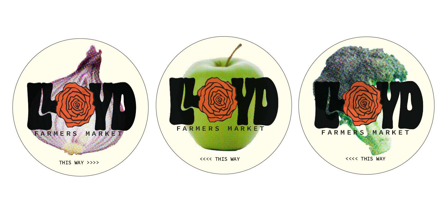
Wayfaring sidewalk decals.
EXECUTION
〰️
EXECUTION 〰️
Logo roughs, Fun fact: the park below this shot is where the market is held. The Lloyd District in Portland’s Eastside is an up and coming urban spot and I wanted to reflect the vintage importance of Lloyd (The Lloyd Center Mall established in the 60’s). Taking a slightly bubbly font and anchoring it with a simple code font gives the timeless urban aesthetic I envisioned. The rose is a flat vector to replace the ‘O’ in Lloyd, and even the brick color is reflective of mid-20th-century.
