BEING SKINCARE, PORTLAND, OR
Package+Brand Design, Ecommerce Design, Web Design. Case Study at bottom of page.

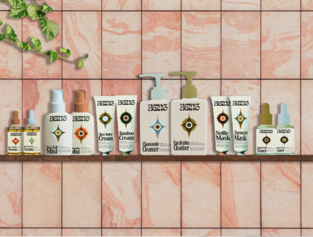
Full Product Line

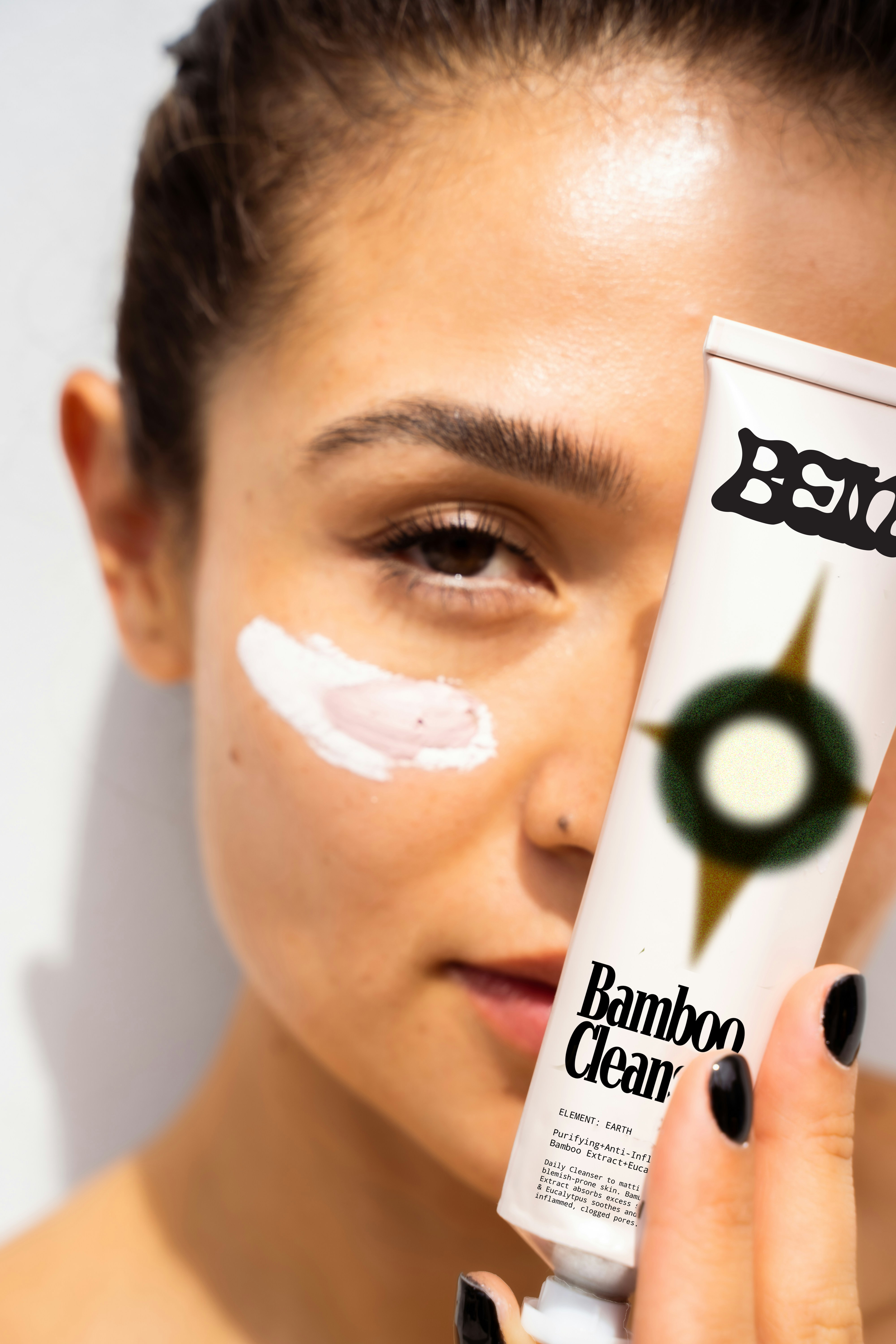
Package Design
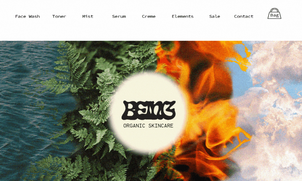
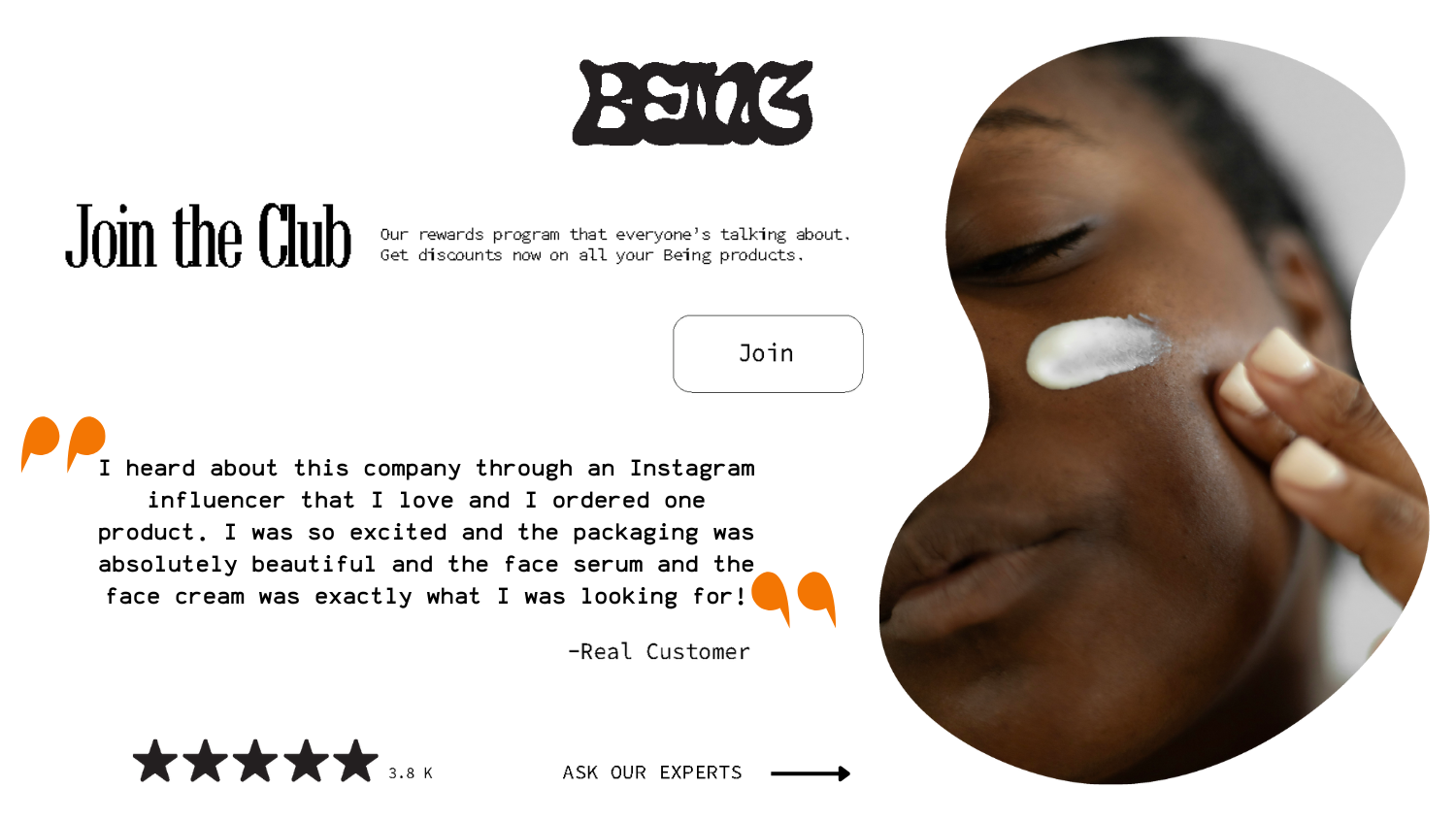


Shop site is simple with most color coming from the photographic elemental motif created to merge all four elements into one image. Creating unity with the products/brand while providing beautiful imagery builds loyalty and trust.