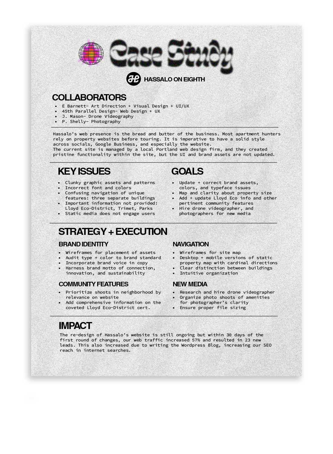
hassalo on eighth- portland, or
Web Design, Brand Identity, UI/UX Design. Case Study at bottom of page.
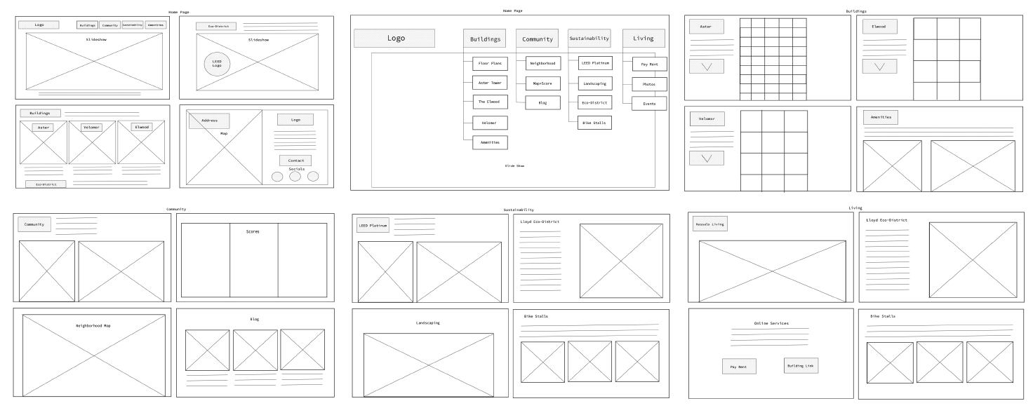
Desktop wireframe


Example layout of the Floorplans and Aster Tower pages
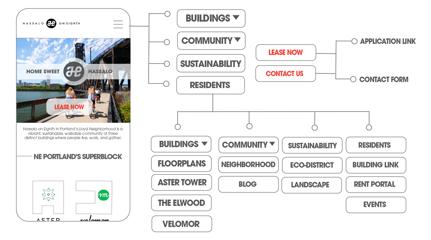
Mobile site menu map
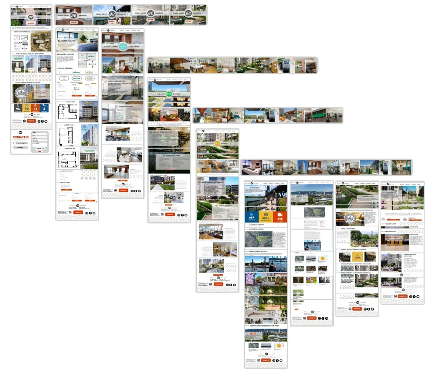
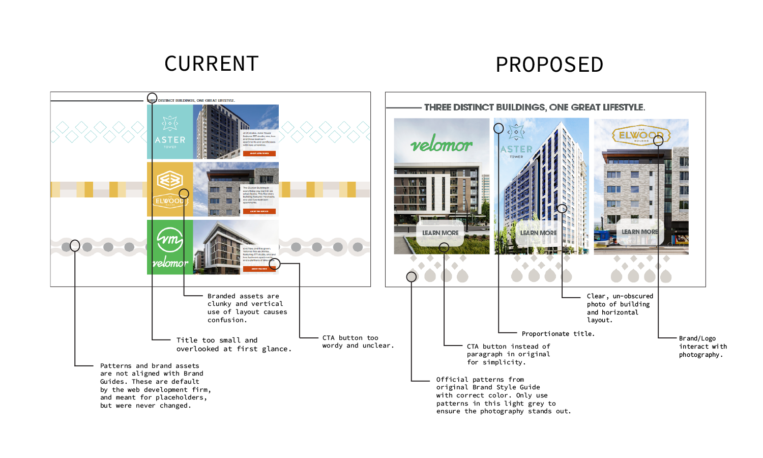
Full desktop page layout
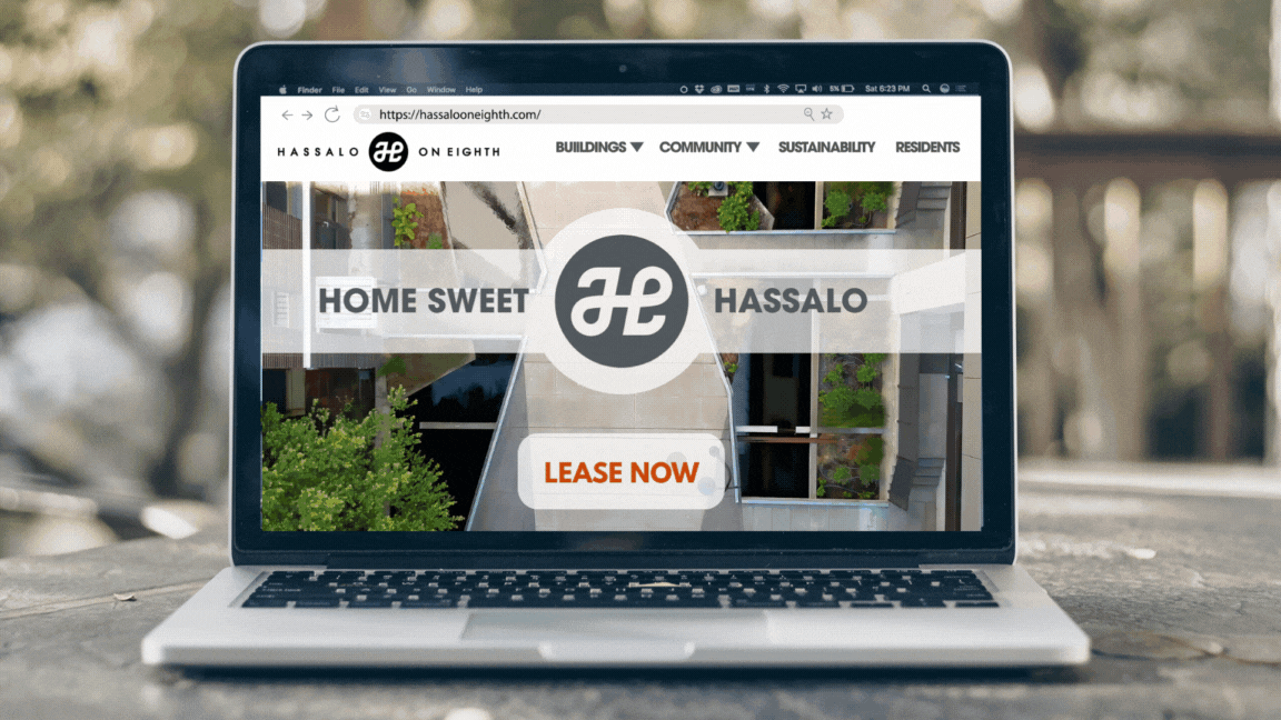
Desktop homepage
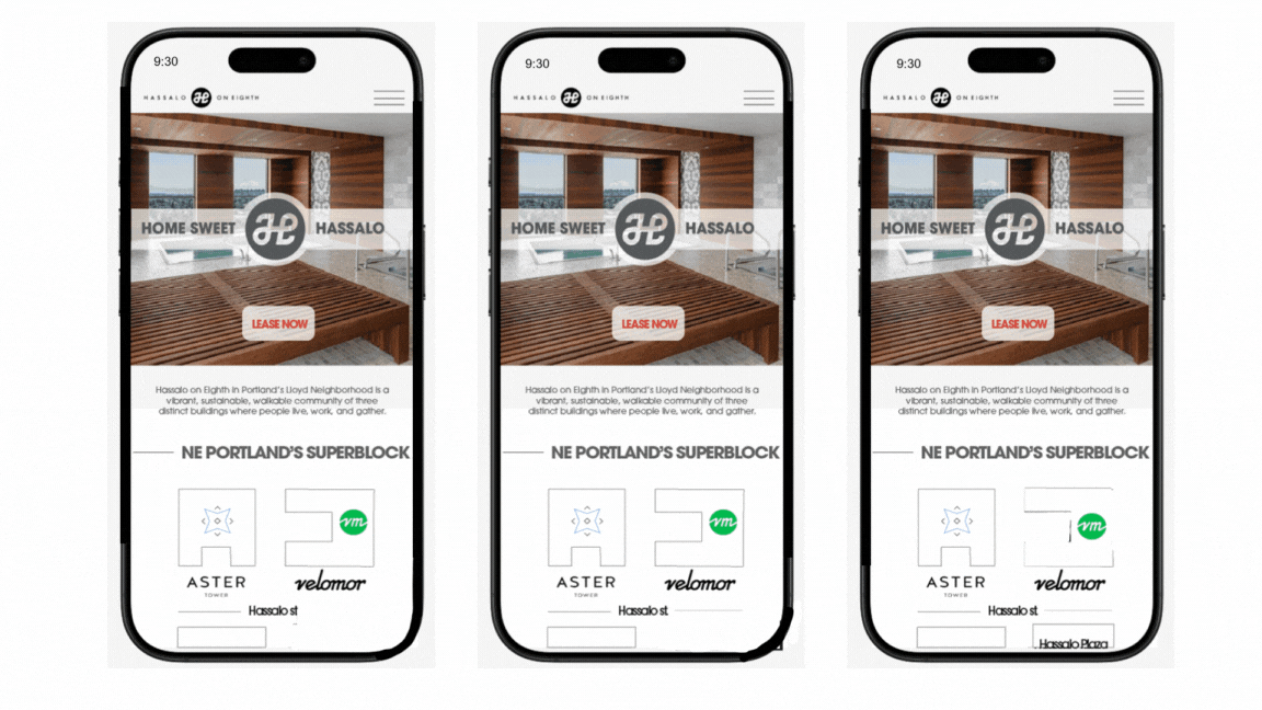
Mobile homepage