creative direction
〰️
creative direction 〰️
Spotify
Synesthesia Series Campaign
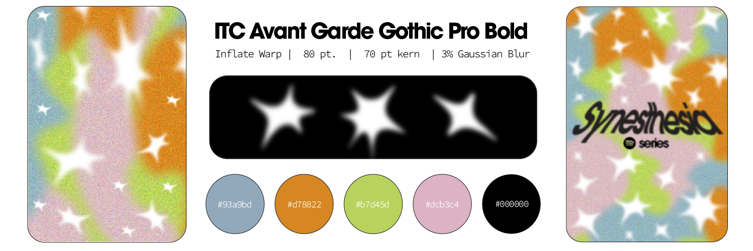
Creative Direction, Art Direction, Visual Design, Campaign Direction, Social Media
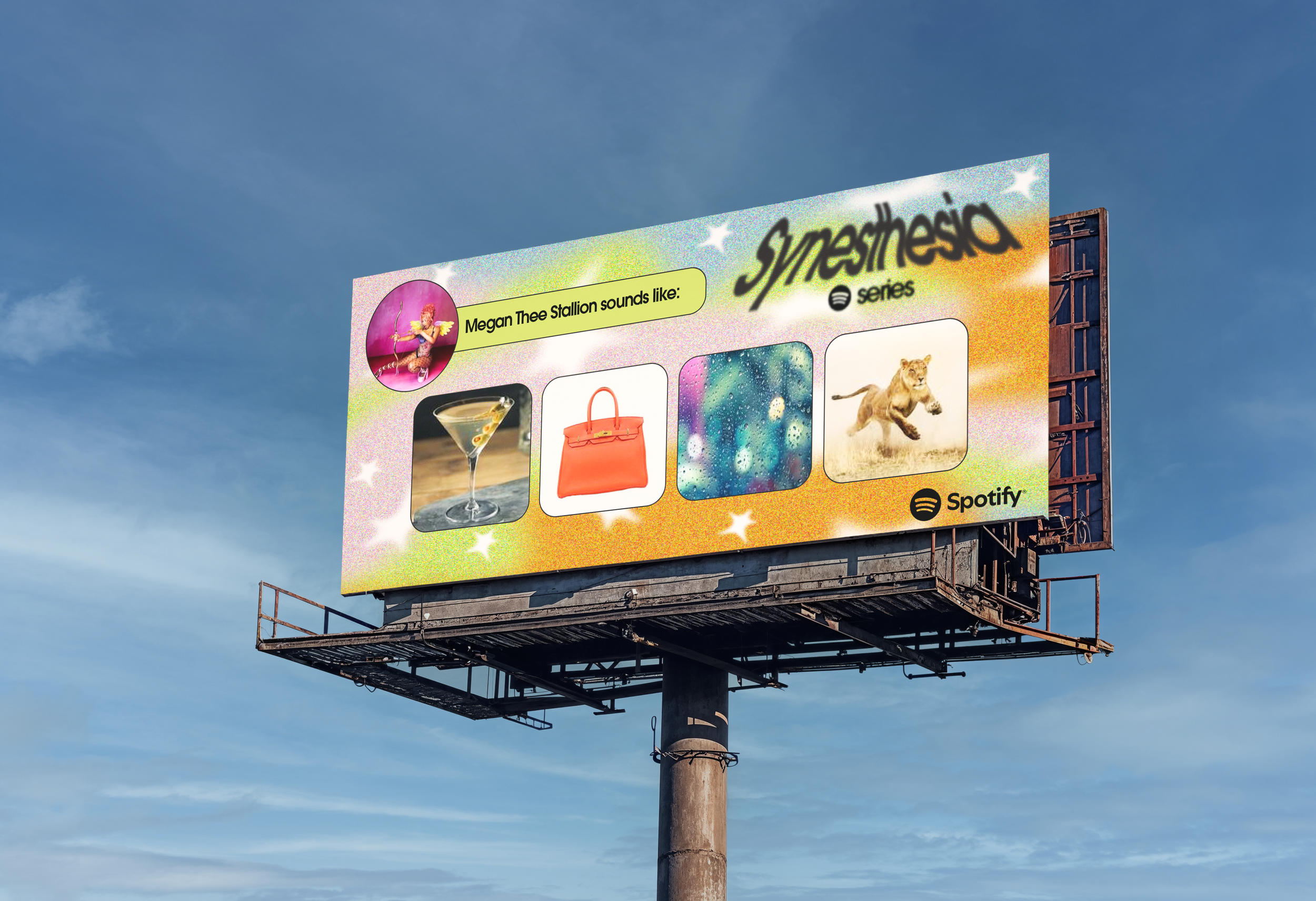
Spotify’s Summer Campaign completely changes the capabilities of the music streaming app. With the Wrapped 2022 campaign, Spotify described expanding the app to become a digital magazine. Here, with the Synesthesia campaign, visual formats will be rolled out to accommodate a refreshed digital magazine experience. Synesthesia is a commonly known neurological phenomenon where our senses can translate through other senses, ie: tasting color. In the spirit of engaging Spotify users, the Synesthesia campaign allows users to add photos and GIFs to their profile categorized by Artist, in order to increase brand loyalty and inspire more visual-focused campaigns in the future.
The Problem: Spotify wants more visual elements added to the app, but integrating a visual component into an audio-focused platform is a challenge.
The Solution: Create a grid-style feature to user accounts for posting photos and GIF’s. The visual feature is rudimentary, no need for filters and effects, just a simple image that sounds/looks/feels like our favorite artists to boost Spotify’s user engagement and allow a built-in visual library for users to express themselves.
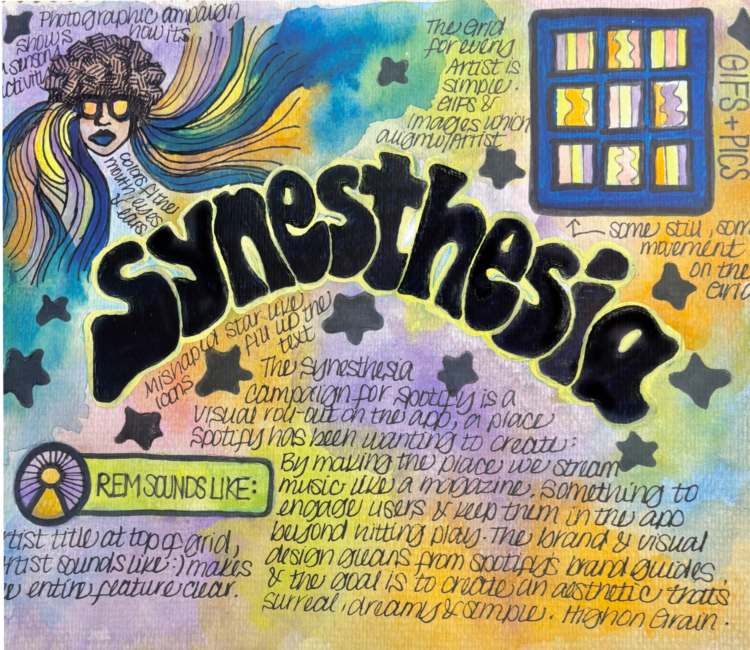
Concept sketch
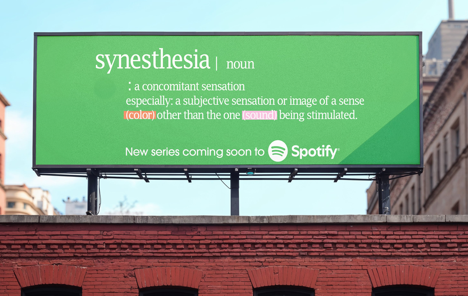
Promo ads do not include the Synesthesia branding, but are kept simple and clean for clarity. A clear definition of the Series name gives Spotify users an idea of the new feature, but doesn’t dive straight into the logistics of the campaign.
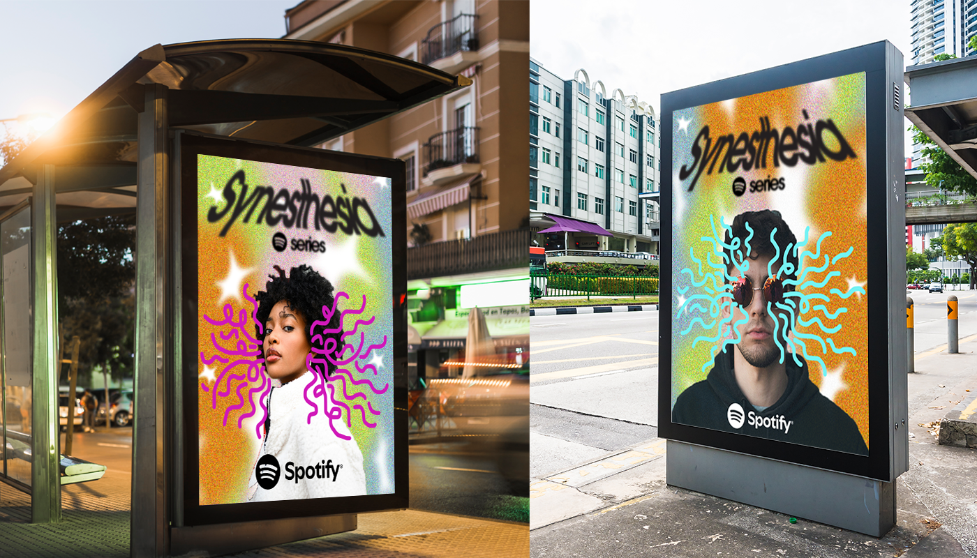
Print ads substitute motion graphics for hand-drawn, curly lines expanding from eyes and ears to integrate the senses as part of the campaign.
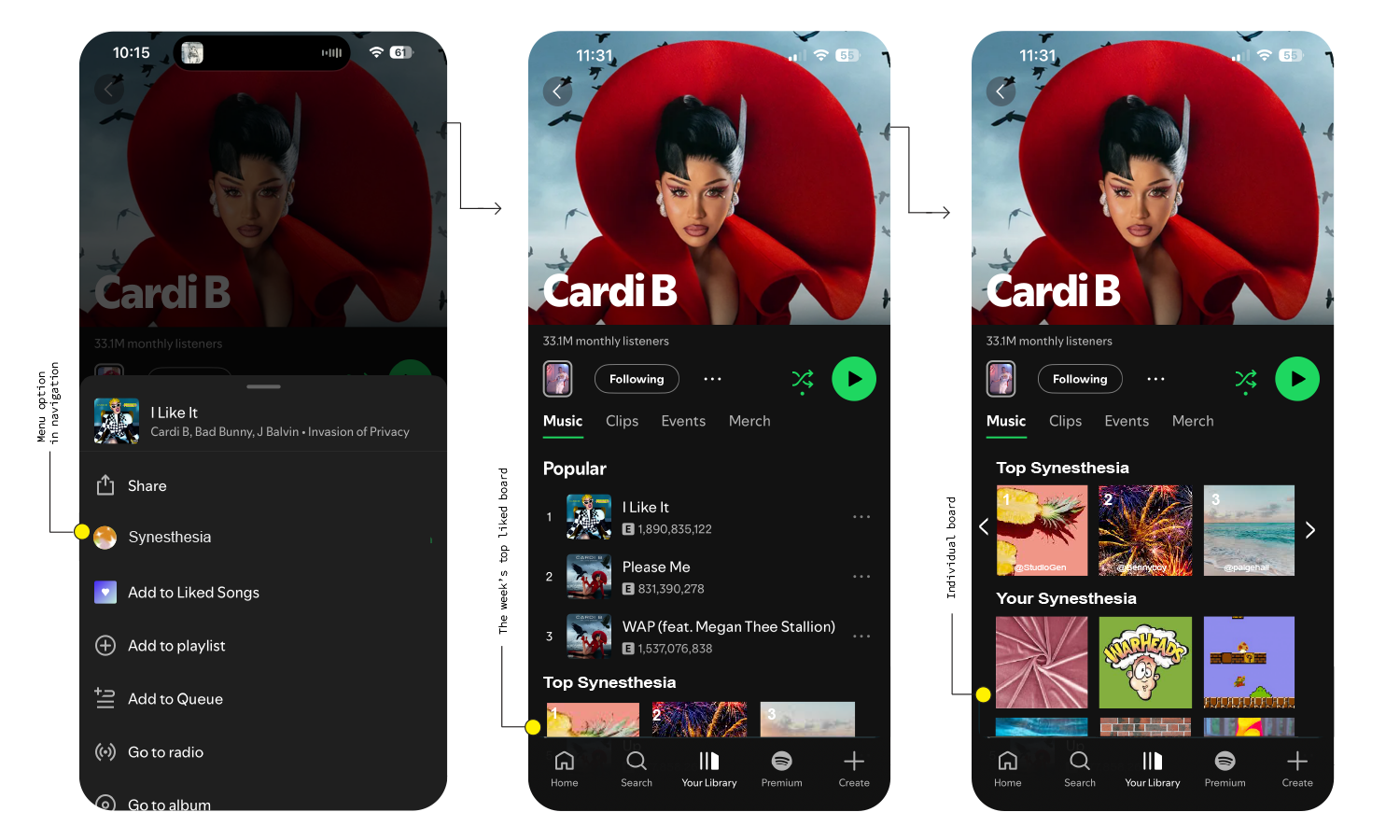
The app must move some menu items to accommodate a new feature, but within the menu, the series can be accessed from the regular menu, the Artist’s page, and user profile. Top liked images will be added to a weekly highlight banner, with the username displayed.